Custom CSS & Javascript: Loading Animations
September 13, 2022

Custom CSS & Javascript: Login Pages
August 16, 2022
Newsletter Q3 2022
November 8, 2022Eye-catching preloaders make time fly!
The default preloader for DocketManager portals works well but have you ever wanted to spice it up?
This blog post will cover the code needed to use different types of preloader animations for your portals.
Let's get into it!
This blog post will cover the code needed to use different types of preloader animations for your portals.
Let's get into it!
GIF Animations
Did you know that it's super easy to animate your logo and use it as a GIF preloader? What better way to increase your portal branding?
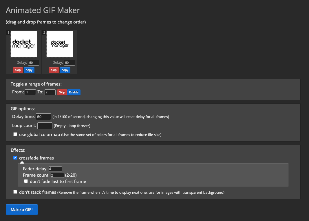
To do this, first visit this website that offers a GIF maker to create download a GIF.
For this example, we have used the stacked format of our DocketManager logo and uploaded 2 images, one that is cropped so that the logo is larger in the square box, and one where the logo is smaller. We also turned on "crossfade frames" so that the transition is a bit smoother.
After you have downloaded your GIF file, upload it to a hosting server or somewhere in your MIS (Customer, Product Item, Order Item, etc.) and copy the link in order to use the file on your portal.
Next, in order to use this GIF, we must first disable the default preloader that is set on the portal. To do this, copy and paste the following into your portal's Custom CSS box:
Next, in order to use this animation, we must first disable the default preloader that is set on the portal. To do this, copy and paste the following into your portal's Custom CSS box:
.paperLoading:before,
.paperLoading:after,
.printLoading {
    display: none;
}
Lastly, we need to insert the GIF into the loading class of the portal. Add the following to your portal's Custom Javascript box and add your image link where it says "your link here":
 function dmLoad(){
$('<img src="your link here').appendTo('.paperLoading');
};
Please note that there can only be one "function dmLoad" per Javascript field. If your portal already has one, simply copy the contents of the examples shown here and paste it before the closing bracket ( } ) of the existing function.
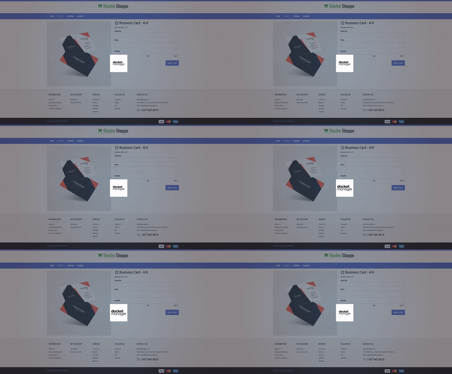
All done! Now your loader will look something like this:
CSS Animations
Cascading Style Sheets (CSS) is code used to style the look of online elements however it can be used for much more than setting visual properties!
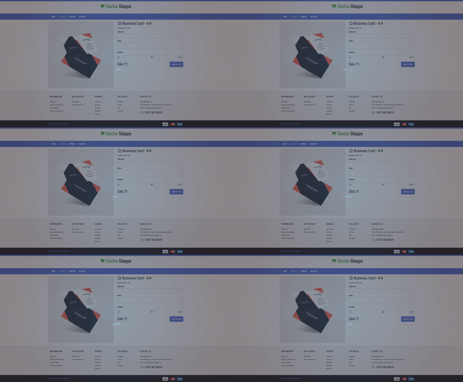
The preloader below is an example of a CSS animation using text but it could be changed to rotate shapes, images, and so much more.
In order to create this CSS animation, we must first disable the default preloader that is set on the portal. To do this, copy and paste the following into your portal's Custom CSS box:
.paperLoading:before,
.paperLoading:after,
.printLoading {
    display: none;
}
While we are at the Custom CSS box, let's stylize the "loading" text as well and set the animation properties.
.paperLoading {
    width: 200px;
    text-align: center;
}

.loading span {
    position: relative;
    display: inline-block;
    text-transform: uppercase;
    opacity: 0;
    transform: rotateX(-90deg);
    margin: 0;
    padding: 0;
    font-family: ‘Arial’, sans-serif;
    font-weight: 100;
    font-size: 18px;
    color: #a3e1f0;
}

.let1 {
    animation: drop 1.2s ease-in-out infinite;
    animation-delay: 1.2s;
}

.let2 {
    animation: drop 1.2s ease-in-out infinite;
    animation-delay: 1.3s;
}

.let3 {
    animation: drop 1.2s ease-in-out infinite;
    animation-delay: 1.4s;
}

.let4 {
    animation: drop 1.2s ease-in-out infinite;
    animation-delay: 1.5s;

}

.let5 {
    animation: drop 1.2s ease-in-out infinite;
    animation-delay: 1.6s;
}

.let6 {
    animation: drop 1.2s ease-in-out infinite;
    animation-delay: 1.7s;
}

.let7 {
    animation: drop 1.2s ease-in-out infinite;
    animation-delay: 1.8s;
}

@keyframes drop {
    10% {
        opacity: 0.5;
    }

    20% {
        opacity: 1;
        top: 3.78em;
        transform: rotateX(-360deg);
    }

    80% {
        opacity: 1;
        top: 3.78em;
        transform: rotateX(-360deg);
    }

    90% {
        opacity: 0.5;
    }

    100% {
        opacity: 0;
        top: 6.94em
    }
}
Next, we need to insert the SVG into the loading class of the portal. To do this, add the following to your portal's Custom Javascript box. The SVG code below could be swapped out with another by deleting all the text starting with the opening tag (
 function dmLoad(){
$('<h1 class="loading"><span class="let1">l</span><span class="let2">o</span><span class="let3">a</span><span class="let4">d</span><span class="let5">i</span><span class="let6">n</span><span class="let7">g</span></h1>').appendTo('.paperLoading');
};
Please note that there can only be one "function dmLoad" per Javascript field. If your portal already has one, simply copy the contents of the examples shown here and paste it before the closing bracket ( } ) of the existing function.
Finished! Time to check out your new CSS preloader!
SVG Animations
Scalable Vector Graphics (SVGs) allow you to keep a high-quality animation in a file format, no matter the size you set it, as they retain vector elements.
Many free SVG loading animation files can be found online and you can even create your own using vector elements or your logo! Today we will be using the example below found in this Codepen submission.
In order to use this animation, we must first disable the default preloader that is set on the portal. To do this, copy and paste the following into your portal's Custom CSS box:
.paperLoading:before,
.paperLoading:after,
.printLoading {
    display: none;
}
While we are at the Custom CSS box, let's stylize the rotating boxes as well. This code could be altered to make the box colours more in line with your branding.
svg {
    transform: rotate(45deg);
}

.gradient {
    animation-iteration-count: infinite;
    animation-duration: 1s;
    fill: url('#gradient-fill');
}

.square {
    animation-iteration-count: infinite;
    animation-duration: 2s;
    transition-timing-function: ease-in-out;
}

.s1 {
    animation-name: slide-1;
}

.s2 {
    animation-name: slide-2;
}

.s3 {
    animation-name: slide-3;
}

.s4 {
    animation-name: slide-4;
}

.s5 {
    animation-name: slide-5;
}

.s6 {
    animation-name: slide-6;
}

.s7 {
    animation-name: slide-7;
}

@keyframes slide-1 {
    37.5% {
        transform: translateX(0px);
    }

    50% {
        transform: translateX(100px);
    }

    100% {
        transform: translateX(100px);
    }
}

@keyframes slide-2 {
    25% {
        transform: translateX(0px);
    }

    37.5% {
        transform: translateX(100px);
    }

    100% {
        transform: translateX(100px);
    }
}

@keyframes slide-3 {
    12.5% {
        transform: translateY(0px);
    }

    25% {
        transform: translateY(100px);
    }

    100% {
        transform: translateY(100px);
    }
}

@keyframes slide-4 {
    50% {
        transform: translateY(0px);
    }

    62.5% {
        transform: translateY(-100px);
    }

    100% {
        transform: translateY(-100px);
    }
}

@keyframes slide-5 {
    12.5% {
        transform: translate(-100px, 0px);
    }

    87.5% {
        transform: translate(-100px, 0px);
    }

    100% {
        transform: translate(-100px, 100px);
    }
}

@keyframes slide-6 {
    62.5% {
        transform: translateY(0px);
    }

    75% {
        transform: translateY(-100px);
    }

    100% {
        transform: translateY(-100px);
    }
}

@keyframes slide-7 {
    75% {
        transform: translateX(0px);
    }

    87.5% {
        transform: translateX(-100px);
    }

    100% {
        transform: translateX(-100px);
    }
}
Next, we need to insert the SVG into the loading class of the portal. To do this, add the following to your portal's Custom Javascript box. The SVG code below could be swapped out with another by deleting all the text starting with the opening tag (
 function dmLoad(){
$('<svg width="100" height="100" viewBox="0 0 300 300"> <defs> <linearGradient id="gradient-fill" gradientUnits="userSpaceOnUse" x1="0" y1="300" x2="300" y2="0"> <stop offset="0%"> <animate attributeName="stop-color" values="#00E06B;#CB0255;#00E06B" dur="5s" repeatCount="indefinite" /> </stop> <stop offset="100%"> <animate attributeName="stop-color" values="#04AFC8;#8904C5;#04AFC8" dur="8s" repeatCount="indefinite" /> </stop> </linearGradient> <clipPath id="clip"> <rect class="square s1" x="0" y="0" rx="12" ry="12" height="90" width="90"></rect> <rect class="square s2" x="100" y="0" rx="12" ry="12" height="90" width="90"></rect> <rect class="square s3" x="200" y="0" rx="12" ry="12" height="90" width="90"></rect> <rect class="square s4" x="0" y="100" rx="12" ry="12" height="90" width="90"></rect> <rect class="square s5" x="200" y="100" rx="12" ry="12" height="90" width="90"></rect> <rect class="square s6" x="0" y="200" rx="12" ry="12" height="90" width="90"></rect> <rect class="square s7" x="100" y="200" rx="12" ry="12" height="90" width="90"></rect> </clipPath> </defs> <rect class="gradient" clip-path="url(#clip)" height="300" width="300"></rect> </svg>').appendTo('.paperLoading');
};
Please note that there can only be one "function dmLoad" per Javascript field. If your portal already has one, simply copy the contents of the examples shown here and paste it before the closing bracket ( } ) of the existing function.
That's it! Time to give your new SVG animation a "spin"!
If you have any ideas for portal customizations you'd like to see us tackle or need help implementing this preloader code, email our support team at support@docketmanager.ca


