Custom CSS & Javascript: Portal Headers
April 22, 2020

Feature Request Content: Version 3.15
April 17, 2020
New Website Launch!
April 29, 2020How's your header?
What better time to work on your portals than the present?
Whether your workload has decreased, you have employees working from home and not enough work to give them, or if you're still busy and want us to do the work for you, spending time customizing your portals and getting customers set up online is always a smart idea that can save you time and money.
Today we will look at portal headers and different ways to customize them.
The Sticky Header
Don't worry, it's not actually sticky to the touch!
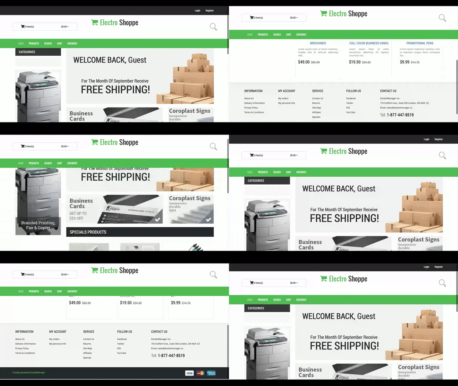
A "sticky" header is one that will stay at the top of your screen versus the top of the page. This means that as you scroll down the page, the header will "stick" to the top of the screen and follow you down the page. Many people utilize sticky headers as it makes navigating the site easier on users.
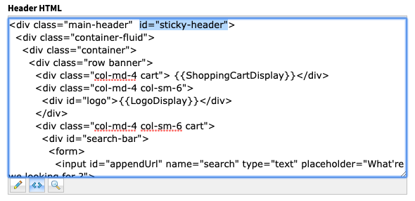
Let's start with adding the ID "sticky-header" to your Header HTML.
This can be found in Settings > Online Configuration > Theme (choose the theme for the portal that you would like this added to) > Customize this Theme > Header HTML.
Copy the following ID and paste it to the div with the class "main-header".
id="sticky-header"
Now let's add the Javascript to make the header sticky only when the user scrolls on the page.
Copy and paste the following code into the Javascript box for the theme. This can be found in Settings > Online Configuration > Theme (choose the theme for the portal that you would like this added to) > Customize this Theme > Javascript.
Copy and paste the following code into the Javascript box for the theme. This can be found in Settings > Online Configuration > Theme (choose the theme for the portal that you would like this added to) > Customize this Theme > Javascript.
function dmLoad() {
var header = document.getElementById("sticky-header");
var sticky = header.offsetTop;
window.onscroll = function() {myFunction()};

function myFunction() {
  if (window.pageYOffset > sticky) {
    header.classList.add("sticky");
  } else {
    header.classList.remove("sticky");
  }
}
};
Lastly, let's add the styling to set the position of the header to "fixed" and above the other content on the page. . Copy and paste the following into the CSS box directly above the Javascript box.
.sticky {
  position: fixed;
  top: 0;
  width: 100%;
    z-index: 999;
    background: #fff;
}

.sticky + .content {
  padding-top: 102px;
}
That's it! Your header should now scroll with the page.
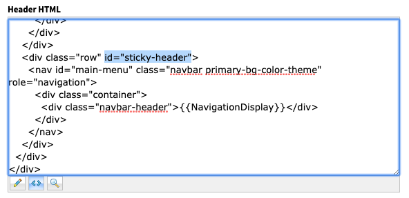
Perhaps the full header is a bit too large to cover the content on the page? Never fear, we can move the ID to the div class surrounding the navigation in order to only have the menu bar sticky.
See the image below for which div to add the ID to.
Perhaps the full header is a bit too large to cover the content on the page? Never fear, we can move the ID to the div class surrounding the navigation in order to only have the menu bar sticky.
See the image below for which div to add the ID to.
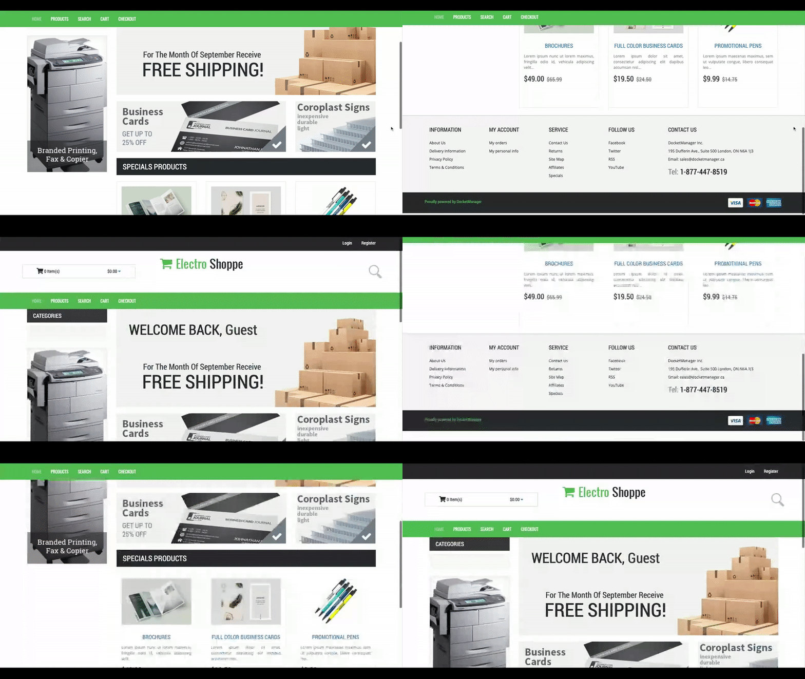
That's the only change you need to make! The menu bar should now be sticky like so:
Collapsing Menu
If you prefer a minimalistic header so that focus is concentrated more on the content of your pages, this collapsing navigation bar may be a good fit for you.
To add this header to your portal, copy the HTML below and replace the existing Homepage HTML in your portal's theme with it.
<div class="main-header">
  <div class="container-fluid primary-bg-color-theme">
    <div class="container">
      <div class="row">
        <nav id="main-menu" class="navbar" role="navigation">
          <div class="col-md-5 collapse-logo">
            <div id="logo">{{LogoDisplay}}</div>
          </div>
          <div class="col-md-3 cart collapse-cart"> {{ShoppingCartDisplay}}</div>
          <div class="col-md-12">
            <div class="navbar-header">{{NavigationDisplay}}</div>
          </div>
        </nav>
      </div>
    </div>
  </div>
</div>
Next, copy and paste the following CSS to your theme's CSS box.
.main-header .navbar .navbar-header {
  float: none;
}
.main-header .navbar .navbar-toggle {
  display: block;
}
.main-header .navbar .navbar-collapse.collapse {
  display: none !important;
}
.main-header .navbar .navbar-nav {
  float: none !important;
}
.main-header .navbar .navbar-nav > li {
  float: none;
}
.main-header .navbar .navbar-collapse.collapse.in {
  display: block !important;
}
.main-header .navbar-nav li a {
  color: #fff;
  font-size: 18px;
}
.main-header .navbar .navbar-toggle {
  border: none;
}
.main-header .navbar-toggle .icon-bar {
  background-color: #fff;
}
#main-menu .navbar-default .navbar-toggle {
  background-color: #2b2b2b;
}
.collapse-logo {
  position: absolute;
  top: 0;
  left: 0;
}
.collapse-cart {
  position: absolute;
  top: 0;
  left: 40%;
  width: 300px;
}
#main-menu.navbar {
  margin: 0px 0px 17px 0px;
}
.main-header {
  margin-bottom: 20px;
}
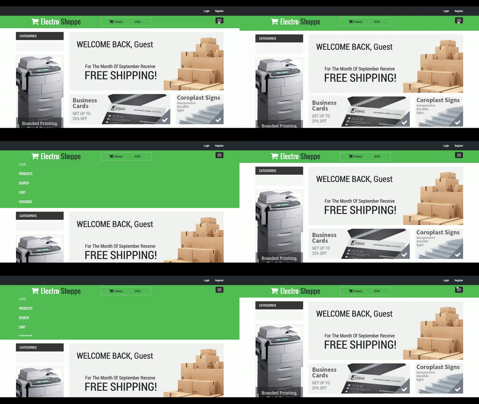
Your header should now display this narrow bar with expanding/collapsing navigation!
If you have any ideas for portal customizations you'd like to see us tackle or need help implementing one of these headers, email our support team at support@docketmanager.ca

