Generate Additional Revenue On Your Portals
October 29, 2019

Smart Lists
October 22, 2019
Custom CSS & Javascript: Fun with Backgrounds
November 5, 2019Let's increase sales!
These days, almost everything can be done online and most of your customers likely prefer placing their orders online as well. Without seeing or speaking to your customers, how do you upsell product options for additional revenue or push new products you think they should try? Or how do you convince a “browsing” user to place an order on your portal?
The goal of all eCommerce websites should be to convert website traffic to sales. It can be difficult to get traffic to your site so once a user has gotten there, you should have the right content in place to entice a purchase. In this blog post we will look at ways to do this on your portals.
The goal of all eCommerce websites should be to convert website traffic to sales. It can be difficult to get traffic to your site so once a user has gotten there, you should have the right content in place to entice a purchase. In this blog post we will look at ways to do this on your portals.
HOOKS
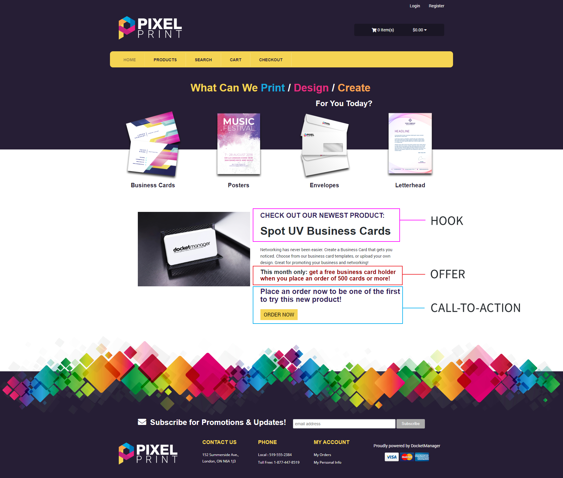
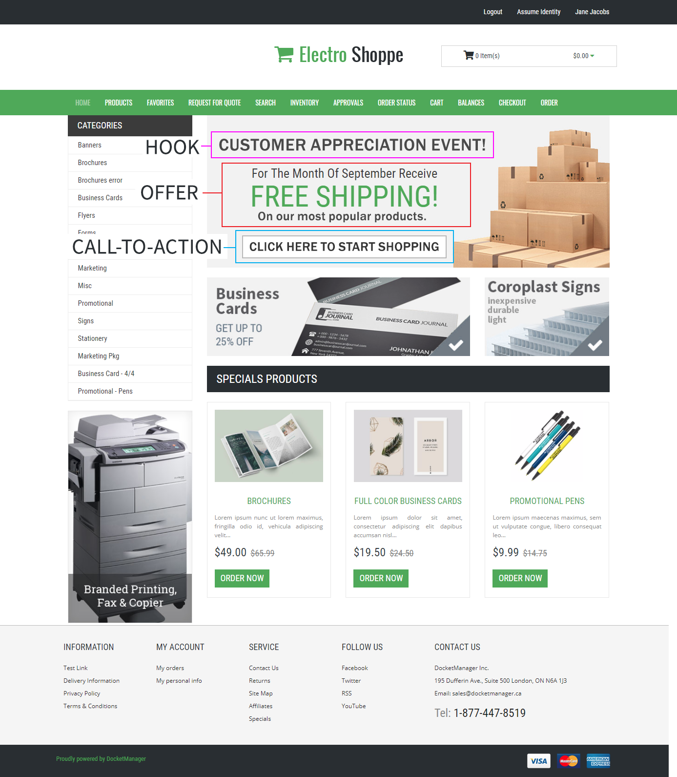
A hook is an eye-catching headline that captures the user’s attention. Keep in mind that you have about five seconds or less before a visitor to your portal decides to continue on your website or leave. This won’t apply to your repeat customers that go to your portal for the sole purpose of ordering a product but browsing customers have a short span of attention before they move on. Your portal’s home page should have a large, eye-catching headline that entices the user to stick around and keep reading. Here are some examples.


OFFERS
Once you have the user’s attention, keep their attention by giving an incentive for them to place an order. This can be a current promotion you are offering or simply a feature you already offer for the product that is enticing. This offer should compel the user to continue reading.


CALL-TO-ACTION
Now that you have the user’s full attention, let’s drive the sale home. A call-to-action is content intended to induce the user to perform a specific action. Essentially, you are giving the user a gentle nudge in the right direction by stating the action they should take next. This call-to-action will likely tell your customers to order a product or visit the product details page to learn more. Because of this, your call-to-action should be a link or have a button right below it so the user can quickly follow the path you have set out for them. If the user has to search for the product themselves, they will likely give up and the sale will be lost.


Now let's take a look at these examples of hooks, offers, and call-to-actions working together to market a product.
Unfortunately the work doesn’t end there. Once the user has followed through to the product page, the content should be designed and written to further convince them to make a purchase. Consider adding product attributes that add additional cost to your products and showing product thumbnails that showcase the most expensive options. Users can be very compelled by pretty pictures.
Need help adjusting your Home Page HTML to generate additional revenue on your portals? Contact our support team at support@docketmanager.ca.
Also, check out our Custom CSS & Javascript blog posts to see other cool features you can add to your portals. Find them here.


